Cleaned up: Forums Home - Let us know your thoughts if any

Do you like the current Forums home page?

  • Yes, the current version looks better

    Votes: 0 0.0%
  • No, bring back the previous version

    Votes: 0 0.0%

  • Total voters
    0

Tom

TIMETOATTACK
Helmet Clan
Joined
Jul 6, 2000
Messages
5,558
Points
5,213
Location
Kuala Lumpur
H all,

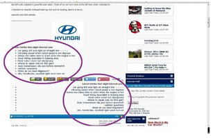
We've cleaned up the Forums Home Listing page (Zerotohundred.com - The Automotive Lifestyle Network)

To simplify and speed up loading times, we've:

  • Removed all forum icons
  • Removed the forum tabs
  • Trimmed its length by combining and removing some forums

Let us know your opinions if you have any. If you think this is a good move, please say so too

thanks
Tom
 
Nice. It loads significantly faster!

My only request is could you colourize the words in the 'user bar' (black in colour just below the ZTH logo on top) like it was in the past? I think I got so used to the old style it took me a while to find "New Posts"

Probably due to my old age :biggrin: So help an old man? *coughcough*
 
Not sure if there is any significant difference in terms of loading time. Probably cause I'm on UniFi. But a bit here and there, no doubt.

Forum homepage looks a lot cleaner now. But I kinda prefer the old one where the homepage published the few recent replies of topics. I find that user friendly to track topics.
 
izso: thanks, do you mean just the "new posts" link?

mr.jy: thanks, what about the "Current Discussions" bar on the right? it does the same thing. was the one that was removed more convenient?
 
izso: thanks, do you mean just the "new posts" link?

mr.jy: thanks, what about the "Current Discussions" bar on the right? it does the same thing. was the one that was removed more convenient?

Tom : yeah. if you could highlight the words "new post" in green or something like in the past
 
ok..just agree with iszo...that "new post" button should be on different colour for easier guide.... :adore:


and wanted to ask about this...only happens on 1st post in every thread....
 

Attachments

  • zth problem.jpg
    zth problem.jpg
    85.2 KB · Views: 108
I guess it does loads a bit faster.
I like the previous "New Post' section as it gives a preview of the post. Not a big fan of that new thing that appear in the thread starter section. I was confused as well when i first saw them.
Regarding the poll, i would be in the "no strong opinion" category if there was one.:)
 
ok..just agree with iszo...that "new post" button should be on different colour for easier guide....
and wanted to ask about this...only happens on 1st post in every thread....

hi pomen gtr: do you mean the duplicate "Latest 10 Posts" feature at the bottom of all first post?
that has been fixed, can you confirm?

Tom : yeah. if you could highlight the words "new post" in green or something like in the past

Not a problem, it is a good link to highlight

I guess it does loads a bit faster.
I like the previous "New Post' section as it gives a preview of the post. Not a big fan of that new thing that appear in the thread starter section. I was confused as well when i first saw them.
Regarding the poll, i would be in the "no strong opinion" category if there was one.:)

are you referring to the "Latest 10 Posts"?
 
izso: thanks, do you mean just the "new posts" link?

mr.jy: thanks, what about the "Current Discussions" bar on the right? it does the same thing. was the one that was removed more convenient?

Oh! I didn't realized it's located on the right now. Much simplified, but it'll work :biggrin:
 
Question : Why are there so many "unregistered" posters now? ZTH is allowing non-registered posts now?
 
Stop the unregistered posters first!!!
 
Top Bottom